Ages ago, when I first started at an agency, I learned a lot about working with clients on logos, mostly through trial and error. Once, after a client killed a perfectly good logo because he didn't like the color green, I decided to always show the first round of logos only in black and white. Why? Because it allows the mark to speak for itself without bias or reliance on color. There were lots of those types of lessons when I first started. Quite frankly I am thankful for them; they have helped me hone a process for myself.
I love getting to work on logos and branding. It is my secret joy when the strategy sends me down a design rabbit hole. I get to dive in, and after lots of doodles, then trying this, trying that, and refining, and refining even more... I have it. (Chef's kiss.) THE logo. And at this point, all I want to do is bring it to life. Anyone else with me? I want to put it on shirts or packaging and show the client what this logo-baby can really become. And then… (cue sad trumpet wah-wah sound) I remember that I need to make two more logos. Here is the thing, the second two, or four, logos are never as good. They just aren't. But the convention has always dictated that the client needs options. But do they? Spoiler alert. No, they don't. It is called the one-concept method and below is a bit about what it is and why you should be using it.
What Is The One-Concept Method?
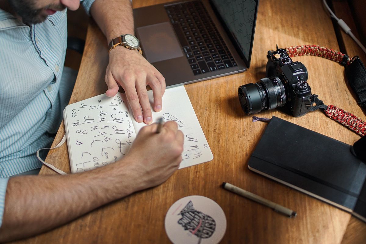
 Photo by marianne bos on Unsplash
It is exactly what it sounds like. Instead of presenting five or even three logos to a client, you present only one. While I didn't come up with this method—it was actually someone named Sean McCabe who did that—it has been a game-changer. Before I put it into practice, the idea of one logo was a little scary. I mean, what if they hate it? The flip side of presenting only one concept though is that you only show the best one. Because there is always one that is the strongest. Sean poses that "design is an iterative process" and that my job as a designer is actually not complete until I refine it to the one that best serves the project goals. Which actually makes a lot of sense. It is a far better solution than presenting five logos and then letting the client arbitrarily combine elements of them into a Frankensteined logo that meets no goals.
Why Clients Should Prefer The One-Concept Approach
 Photo by Raquel Martínez on Unsplash
As a client, you are paying for my expertise. You are investing in my services because while you know your business best, you also know I can translate all of your knowledge and experience as an owner into something that is both strategically sound and beautiful to look at: a branding package that is aligned with your company goals, personality, and ideal customer. If I haven't distilled it down to the one best solution I can create, then I have not finished the task. Of course, there will still be refinements based on feedback as the process is collaborative. But diluting a single strong concept with five other options? Not a chance.
Why Designers Should Prefer The One-Concept Approach
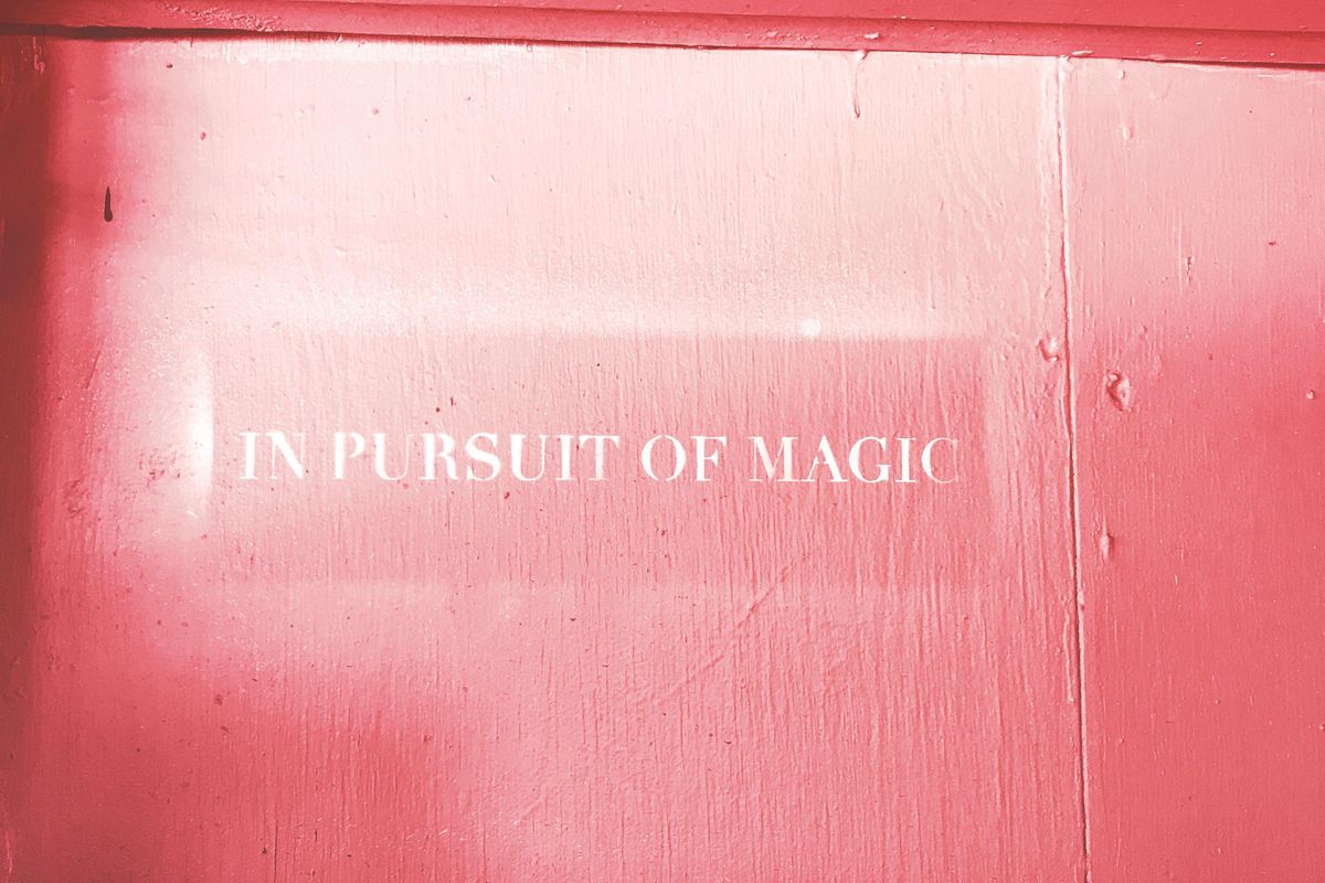 Photo by Karly Santiago on Unsplash
Remember that logo rabbit hole I mentioned earlier? THAT is precisely why designers should love the one-concept method. It allows for a much deeper dive to create the best logo for the project goals and the time to really showcase how it can be used. All of that attention to detail that gets put into a logo, plus more context than a black and white logo on a page. You can show patterns, logo use variations, color palette, and other elements like custom icons. Because HOW it is used is what really gets clients excited. When clients can clearly see how the branding is all going to fit together in real-world applications is where the fun starts for them. Clients light up when they see their custom branded items using the logo brought to life.
A streamlined approach is certainly a win for this method, but another big win is that you are only showing one logo that you are incredibly proud of instead of one great one, and a few others you secretly hope the client doesn't choose. Quality over quantity, right? In a business where your work IS how you get hired for other projects, why not only show work that will actually do that?
- 8 Design Trend Predictions For 2022 - Work It Daily ›
- The Benefits Of Slowing Down In The Design Business - Work It Daily ›
- 5 Benefits Of Hiring Creative Employees ›

 Bigstock
 Bigstock
 Bigstock